Y Travel Blog
This analysis looks at how Y Travel Blog organizes a very large destination archive, and at the gap between where the site's trust signals sit and where its paid products sit.
Y Travel Blog is written by Caz and Craig Makepeace, who introduce themselves in the hero as professional travel bloggers with more than twenty five years of travel behind them. The site is worth studying because it has built almost every piece of publishing infrastructure a serious travel business is told to build, including editorial guidelines, a disclosure statement, a press page, a named team, a deep regional taxonomy and a paid group trip line. The interesting question is not whether those pieces exist. It is whether the homepage lets a reader find them.
First Impressions
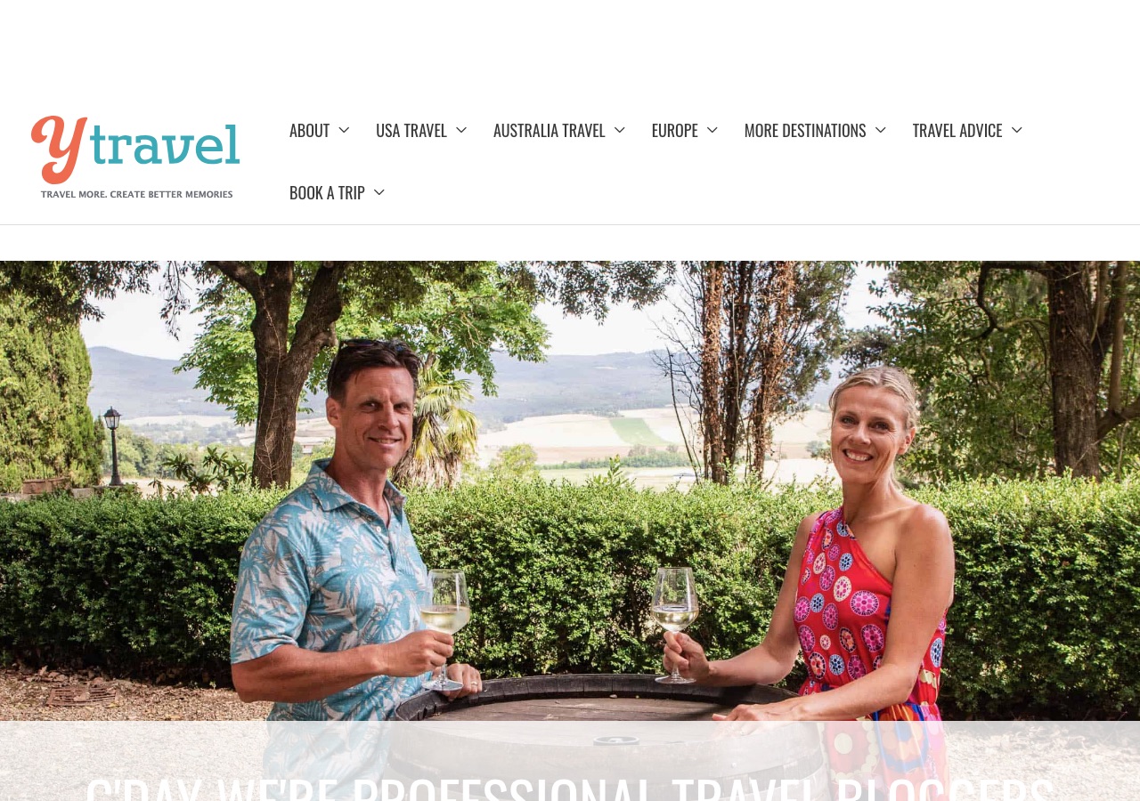
The first screen is crowded before any content appears. A band of empty space sits above the logo where an advertising unit loads, then the logo and its tagline, then a navigation bar carrying seven top-level items with dropdown arrows, wide enough that Book A Trip wraps onto a second row. Below a thin divider, a full-width photograph of Caz and Craig runs to the bottom of the viewport, and the headline set across it, an all-caps line introducing them as professional travel bloggers, is cut off by the fold and overlaps the subjects of the photograph it sits on. The impression is of a site that has more to say than the first screen can hold, and the compression falls on the one element meant to introduce the brand.
Design Scorecard
A structured assessment across six dimensions. These scores reflect observed patterns, not absolute judgments.
Layout & Structure
The first screen is built from four stacked bands before any content begins. At the very top sits a band of empty space reserved for an advertising unit, which pushes everything below it down on every load. Under it, a white band carries the logo on the left, a coral and teal wordmark with the tagline set in small capitals beneath it, leaving the right two thirds of that row empty. The third band is the navigation, which holds seven labels each with a dropdown arrow, and runs wide enough that Book A Trip drops onto a second row of its own. A thin grey divider closes the header, and then a full-width photograph of Caz and Craig fills the remainder of the viewport, with an all-caps headline set across its lower edge, overlapping the subjects and cut off by the fold. Below the fold the page continues as full-width stacked sections with no sidebar, running through the founders' introduction, the newsletter block, latest posts, recent international travel, top travel tips, inspiration, a USA destinations block, social follows and finally the As Seen In row.
What Works Well
- The destination taxonomy is well built. USA Travel and Australia Travel are promoted to top level and then broken down by region rather than by state list, which matches how people plan a road trip.
- Trust infrastructure is unusually complete for an independent blog. Editorial Guidelines, a Disclosure Statement, a Press page and a Meet Our Team page all sit in the footer, and the affiliate disclosure on the booking pages is written in plain language.
- The As Seen In row near the foot of the homepage names real publications, which does more for a first-time reader than a generic credibility claim.
- Email capture is placed early, directly after the introduction and before the latest posts, at the point where a reader who likes the founders is most likely to act.
- Hero copy states the promise in the site's own voice, travel more and create better memories, and the same line appears in the logo tagline and the newsletter block, so the positioning is consistent across surfaces.
What Limits Growth
These are not failures. They are structural constraints that, over time, may limit the blog's ability to evolve.
- Seven top-level items, all with dropdowns, is more than a navigation bar can carry at common desktop widths. The wrap to a second row pushes Book A Trip, the only item that leads to a paid product, into the least prominent position in the menu.
- Book A Trip is a single label doing two different jobs. The page it opens is a list of affiliate booking partners, while the actual paid group trips to Morocco, Vietnam and Thailand are only reachable from the dropdown. A reader who clicks the label rather than hovering never sees the product.
- The hero headline is clipped by the fold and set over the busiest part of its own photograph, so the sentence that introduces the founders is the hardest sentence on the page to read.
- The homepage runs nine distinct sections, several of which overlap in purpose, including top travel tips, get inspired to travel and a USA destinations block. Overlapping sections dilute each other rather than compounding.
- The advertising slot above the logo pushes the brand down the page on every visit, which is a recurring cost paid by the site's own identity.
Strategic Takeaways
What can other travel bloggers learn from this analysis?
- Trust assets only count when a reader can reach them. Editorial guidelines and a disclosure statement buried in a footer do less work than a single link to them near the content they govern.
- A navigation label should have one job. When the same word points to both an affiliate list and a paid product, the higher margin option is the one that gets lost.
- Depth in a taxonomy is an asset; depth in a top-level menu is a tax. Regional breakdowns belong inside a dropdown, not as siblings of it.
- Advertising placed above the logo is not free inventory. It is charged to brand recognition every time the page loads.
Redesign Considerations
If this blog were redesigned, these are the structural changes worth considering. Not prescriptions, starting points.
- Reduce the top-level menu to four or five items so it holds on one row, folding USA Travel, Australia Travel, Europe and More Destinations into a single destinations menu with the regions inside it.
- Split the Book A Trip label into two: one entry for the group trips, which are the owned product, and a separate resources or booking entry for the affiliate partner list.
- Reposition the hero headline into a solid area of the image or a band beneath it, and set it to a size that resolves fully above the fold on a laptop screen.
- Consolidate the overlapping inspiration and tips sections into one, and give the remaining sections distinct jobs so each one earns its place on the scroll.
- Link the Editorial Guidelines and Disclosure Statement from the article template rather than only from the footer, so the strongest trust assets sit where the commercial links are.
Closing Thoughts
The design story is one of a site that built the whole apparatus of a publishing business and then asked a header designed for a smaller version of itself to carry all of it. Editorial guidelines, a disclosure statement, a press page, a named team, a regional taxonomy deep enough to plan a real trip, and a line of paid group trips are all present and all real. Very few independent travel blogs assemble that much. The homepage is where the assembly shows: each addition took a place in the menu or a band on the page, and the first screen now spends most of its height on structure before a reader reaches anything to read.
The question going forward is one of subordination rather than addition. The paid trips are the highest margin thing the site sells and currently sit behind a shared label on the least prominent row of the menu, while the affiliate resource page holds the label itself. Resolving that means deciding which of the seven top-level items gives up its position, and that is an editorial judgment about what the business is now rather than a layout adjustment. The trust assets face the same choice: they are strong enough to move forward and are currently kept in the footer, where the readers who most need them are least likely to look.
Design is not decoration. It's the scaffolding that holds everything else up.
Occasional notes
I sometimes send short notes about design, structure, and monetization in travel blogs.
No schedule. No noise.
Want this level of analysis on your own blog? The same six dimensions, written privately about your site.
Request a blog design audit——→