Nomadic Matt
This analysis looks at how Nomadic Matt structures its homepage and articles, and how those decisions support — or limit — monetization over time.
Nomadic Matt is one of the most referenced travel blogs in the industry. It's been online since 2008, and its longevity makes it a useful case study for understanding how design decisions compound over time.
First Impressions
The site feels established and authoritative, but also heavy. There's a sense of accumulated content — years of posts layered on top of each other. The design is functional rather than beautiful. It prioritizes utility over emotion, which works for its SEO-first strategy but creates a slightly impersonal first impression.
Design Scorecard
A structured assessment across six dimensions. These scores reflect observed patterns, not absolute judgments.
Layout & Structure
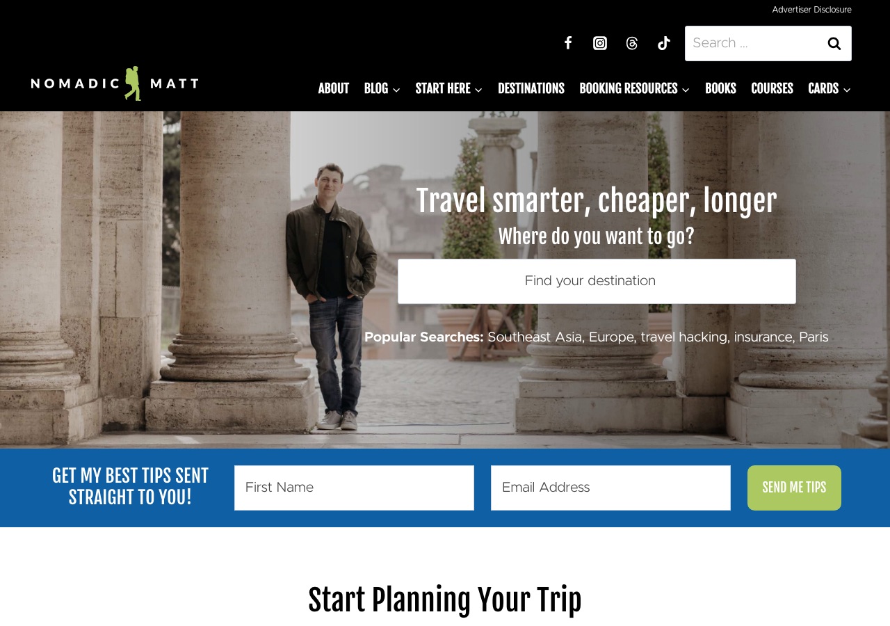
The homepage follows a traditional blog layout: header, hero area, content grid, and sidebar. This structure made sense when the blog launched, but it now creates tension with modern reading expectations.
What Works Well
- Strong brand recognition built over 15+ years
- Clear value proposition visible immediately
- Well-organized destination guides with logical hierarchy
- Email capture is prominent but not aggressive
- Affiliate links feel native to the content
What Limits Growth
These are not failures. They are structural constraints that, over time, may limit the blog's ability to evolve.
- Visual design feels dated compared to newer competitors
- Homepage tries to do too much, creating cognitive load
- Mobile experience prioritizes ads over content flow
- Category pages lack visual hierarchy and breathing room
- The sidebar model creates clutter on desktop
Strategic Takeaways
What can other travel bloggers learn from this analysis?
- Authority compounds, but so does design debt
- SEO-first design works until user expectations shift
- Monetization integration should evolve with the platform
- Trust is earned through consistency, not just credentials
Redesign Considerations
If this blog were redesigned, these are the structural changes worth considering. Not prescriptions, starting points.
- Simplify the homepage to focus on 2-3 primary user journeys
- Reduce sidebar density and consider eliminating it entirely on article pages
- Introduce more whitespace in article layouts
- Consider a visual refresh that maintains brand recognition while feeling more contemporary
Closing Thoughts
Nomadic Matt is a study in longevity. The blog has survived and thrived through multiple eras of travel blogging, adapting its content strategy while keeping its core design largely intact.
That consistency is both a strength and a constraint. The design decisions that worked in 2010 now create friction. The question is not whether the blog is successful, it clearly is. The question is whether its design infrastructure can support the next decade.
Design is not decoration. It's the scaffolding that holds everything else up.
Occasional notes
I sometimes send short notes about design, structure, and monetization in travel blogs.
No schedule. No noise.
Want this level of analysis on your own blog? The same six dimensions, written privately about your site.
Request a blog design audit——→