The Blonde Abroad
This analysis looks at how The Blonde Abroad asks one homepage to carry three different businesses at once: an editorial archive, a personal brand, and a set of owned products. The interesting question is not whether the design is attractive, it plainly is, but what that combination costs the navigation.
The Blonde Abroad is a personal-brand travel blog published under the name Kiersten, and the homepage tagline describes it as an award-winning solo female travel blog covering travel tips, packing guides, videos and photography. What separates it from a conventional blog is the product layer sitting alongside the writing. The primary navigation gives permanent slots to a Lightroom presets line and a Travel Shop, the Resources menu routes to travel credit cards and blogging resources, and the homepage promotes an all-female tour brand that lives on its own domain. The site runs on WordPress with WooCommerce, so the store is not a link out to a third party, it is part of the same property.
First Impressions
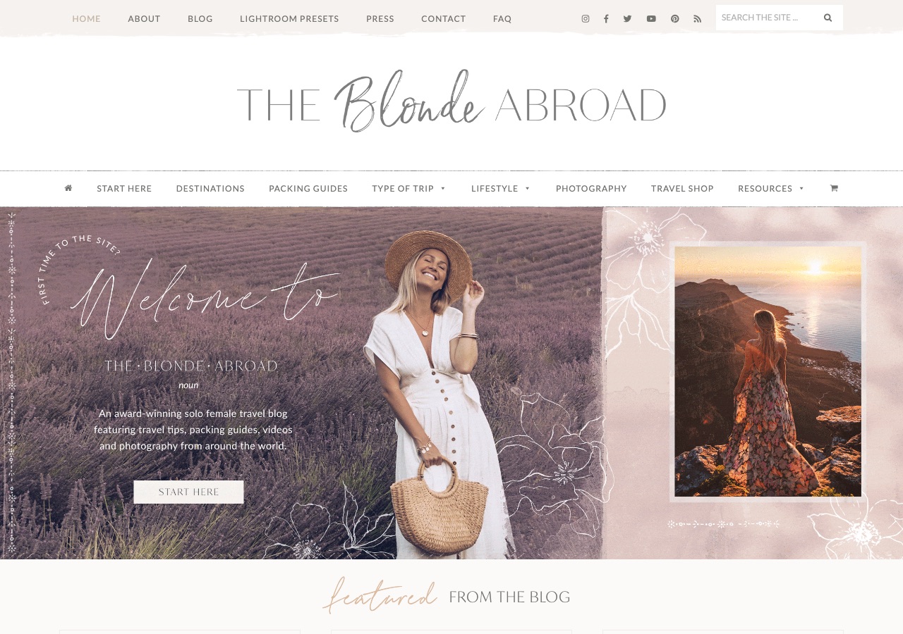
The page opens with three stacked header bands before any content appears. A utility row carries Home, About, Blog, Lightroom Presets, Press, Contact and FAQ alongside six social icons and a search field. Below it, a full-width band holds the wordmark on white. Below that, a second navigation bar carries Start Here, Destinations, Packing Guides, Type of Trip, Lifestyle, Photography, Travel Shop, Resources and a cart icon. Only then does the hero arrive, and it is well art-directed: a split composition with a lavender-field portrait on the left, the site name set in a mixed script and small-caps lockup, and a pale blush panel on the right holding line-drawn florals around an inset framed photograph. The overall impression is of a brand that knows exactly what it looks like, presented through a menu system that has grown faster than the frame around it.
Design Scorecard
A structured assessment across six dimensions. These scores reflect observed patterns, not absolute judgments.
Layout & Structure
The homepage stacks three full-width header regions before any content begins. First a cream utility bar carrying Home, About, Blog, Lightroom Presets, Press, Contact and FAQ, with six social icons and a Search the Site field pushed to the right edge. Second a white band holding the wordmark alone, set in a mixed lockup of wide small caps and a script Blonde. Third a rule-bounded menu running Start Here, Destinations, Packing Guides, Type of Trip, Lifestyle, Photography, Travel Shop and Resources, bracketed by a home icon and a cart icon. The hero below is split rather than full-bleed: roughly two thirds is a lavender-field photograph carrying an arced First Time to the Site line, a large script Welcome To, the site name, a one-sentence description and a Start Here button, while the remaining third is a blush panel of white line-drawn florals framing a single inset photograph. The first content region, a cream band titled featured from the blog, begins only at the bottom edge of the first screen. Visual weight sits with the hero photography and the wordmark, while the two menus, which carry the most navigational information, are the lightest elements on the page.
What Works Well
- The art direction is consistent and owned. The blush palette, the script and small-caps lockup, and the illustrated floral panel form a visual signature that would be recognizable without the logo.
- Products get permanent navigation slots rather than pop-ups. Lightroom Presets and Travel Shop sit in the menu as destinations, which frames them as part of the offer instead of an interruption to the reading.
- The hero is kept free of advertising. Display ads run on the site, but the first screen is reserved entirely for the brand and a single Start Here call to action.
- Email capture is specific rather than generic. The mid-page form offers a named asset, a carry-on packing guide, which gives a reader a concrete reason to trade an address.
- A dedicated Press page and a stated country count give the personal brand external reference points, which matters more here than on a purely editorial site.
What Limits Growth
These are not failures. They are structural constraints that, over time, may limit the blog's ability to evolve.
- Two full navigation systems compete for the same job. A reader looking for destination content can plausibly start from either bar, and neither one is presented as the primary path.
- The Type of Trip menu holds nine subsections, each with its own featured articles. At that width a dropdown stops functioning as a menu and starts functioning as a second homepage.
- Several visible section titles are set as decorative script rather than semantic headings, so the page reads with more structure than its underlying outline carries. There is no h1 on the homepage.
- The script lettering that gives the brand its character is set over photography in the hero, where contrast is lowest and the words are hardest to scan quickly.
- Three revenue surfaces, presets, the shop and the tour brand, each get a homepage moment, which leaves the editorial content sharing attention with three competing offers on the same scroll.
Strategic Takeaways
What can other travel bloggers learn from this analysis?
- A strong visual identity can absorb a great deal of structural complexity before a reader notices, which is exactly why the complexity keeps accumulating.
- When products earn permanent navigation slots, monetization stops reading as advertising and starts reading as catalog.
- Two menu systems is usually one menu system plus a decision that was never made.
- Decorative lettering is a brand asset in a hero and a legibility cost in a section title. The two uses deserve separate rules.
Redesign Considerations
If this blog were redesigned, these are the structural changes worth considering. Not prescriptions, starting points.
- Merge the two navigation bars into one, and treat the utility items, Press, FAQ, Contact, as footer or secondary links rather than peers of Destinations.
- Cap the Type of Trip dropdown at the four or five trip types that carry the most content, and move the remainder to a browsable index page that can grow without touching the menu.
- Reserve the script typeface for the wordmark and hero, and set section titles in the small-caps face already in the system so the visual and semantic outlines agree.
- Give the homepage a single h1 that names the site and its subject, which costs nothing visually and repairs the document outline.
- Decide which of the three product surfaces leads on the homepage and let the other two live one click deeper, so the scroll has one commercial arc rather than three.
Closing Thoughts
The design story here is a brand that outgrew its container. The identity work is resolved and consistent: a palette, a lettering system, an illustrated motif that recurs without repeating. What surrounds it is the accumulated structure of a business that added a presets line, a store and a tour company to a blog, and gave each of them a permanent place in the menu rather than choosing between them. Every individual decision reads as reasonable. The sum is a header that occupies roughly a third of the first screen.
The tension going forward is that the navigation has little room left to absorb another product. Two menu bars and a nine-section dropdown are already at the edge of what a reader will parse, so the next addition has to displace something rather than sit beside it. That makes the open question less a design question than an editorial one: which of the three revenue surfaces is the one a first-time visitor should meet, and what would the homepage look like if the other two were allowed to live a click deeper.
Design is not decoration. It's the scaffolding that holds everything else up.
Occasional notes
I sometimes send short notes about design, structure, and monetization in travel blogs.
No schedule. No noise.
Want this level of analysis on your own blog? The same six dimensions, written privately about your site.
Request a blog design audit——→