Hand Luggage Only
This analysis looks at a homepage that is almost entirely photography, and at what disappears when images do all the structural work. The tile grid ranks content clearly. Everything a reader would use to judge that content, a date, a byline, a category, is somewhere else.
Hand Luggage Only is a United Kingdom travel and lifestyle blog covering travel, photography and food, and the page title also mentions home and a travel planner. It runs on WordPress and earns through display advertising, affiliate content and brand partnerships, with a Work With Us page reachable from the Contact dropdown. The design commitment is unusually clear for a blog of this size: the homepage is a grid of full-bleed image tiles with titles set over them, and there is no sidebar, no introduction, and no author panel competing with the photography.
First Impressions
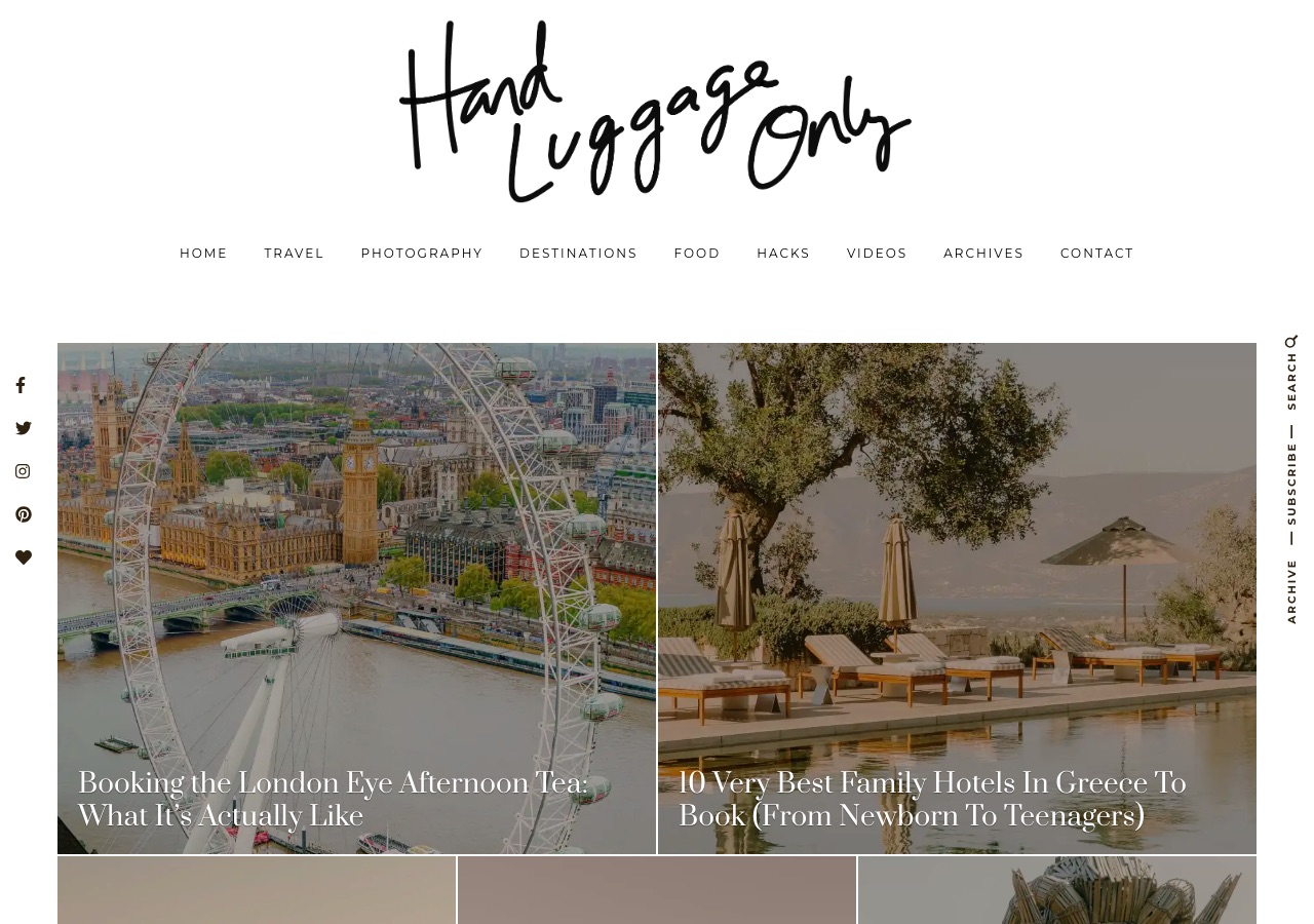
The page opens with a large handwritten script wordmark on plain white, with no image behind it, followed by a single letter-spaced menu: Home, Travel, Photography, Destinations, Food, Hacks, Videos, Archives, Contact. Two vertical rails frame the content, social icons stacked down the left edge and Search, Subscribe and Archive set in rotated type down the right. Then the grid begins: two large tiles side by side, each a full-bleed photograph with a serif title laid over the lower left, followed by a row of three smaller tiles. It looks like a magazine contents page, and it is the most visually confident opening of the four sites in this batch. It is also the least informative. The two lead tiles carry a title and nothing else, no date, no category, no author.
Design Scorecard
A structured assessment across six dimensions. These scores reflect observed patterns, not absolute judgments.
Layout & Structure
The page opens on white with no imagery at all: a large handwritten script wordmark centered at the top, and beneath it a single row of letter-spaced caps reading Home, Travel, Photography, Destinations, Food, Hacks, Videos, Archives and Contact. Two vertical rails frame the content rather than sitting in the header. Social icons stack down the left edge, and rotated type down the right edge reads Search, Subscribe and Archive. The content region is then a full-width tile grid with no sidebar. Two large tiles sit side by side, each a full-bleed photograph with a serif article title laid over its lower left corner and nothing else on the tile, followed by a row of three narrower tiles beginning at the fold. The grid runs edge to edge within the rails, so almost the entire first screen below the wordmark is photography. Visual weight is split between the script wordmark, the only black mass on the white ground, and the two lead photographs, which carry the ranking.
What Works Well
- Tile size does the ranking, and it does it without a single label. Two large lead tiles, then a row of three, tells a reader what the editors consider most important before any text is read.
- The script wordmark is set on white rather than over an image, so the strongest brand asset is given clean space and full contrast at the top of every page.
- There is no sidebar. The content area runs the full width of the grid, which is what makes the magazine-contents effect possible and removes an entire class of clutter.
- The two vertical rails move search, subscribe and social links out of the horizontal menu, keeping the primary navigation to category names only.
- The category system is distinct in substance, not only in label. Travel, Photography, Food and Hacks are four different reasons to visit, and each carries its own dropdown of subsections rather than being a label on the same content.
What Limits Growth
These are not failures. They are structural constraints that, over time, may limit the blog's ability to evolve.
- The homepage has no h1, and article titles are set as h2 while section and sidebar titles use h3. The document outline does not describe the page a reader sees, which affects search engines and assistive technology equally.
- Titles are set directly over photographs, and legibility depends on whichever part of the image happens to sit beneath the text. Where the underlying photograph is light, the serif type loses contrast.
- The lead tiles carry no publication date, category or byline. For a site whose content includes hotel and attraction recommendations, a reader cannot tell whether a recommendation is current without opening it.
- Secondary titles are truncated with an ellipsis rather than wrapped, so several entries read as fragments and give a reader nothing to decide on.
- Archives is a top-level navigation item, which is usually a sign that the category system is not carrying the depth of the archive and readers are being handed a chronological list instead of a route.
Strategic Takeaways
What can other travel bloggers learn from this analysis?
- Photography can establish hierarchy on its own. It cannot establish credibility on its own, because credibility is carried by the metadata that photography replaces.
- A date is a design element. On recommendation content it is the difference between a guide and an artifact.
- Truncating a title to protect a layout trades a reader's decision for a tidy grid, which is rarely the right side of that trade.
- When Archives earns a permanent menu slot, the taxonomy is asking for attention, not the archive.
Redesign Considerations
If this blog were redesigned, these are the structural changes worth considering. Not prescriptions, starting points.
- Add a homepage h1 naming the publication and its subject, and set article titles as h2 beneath it, so the document outline matches the visible hierarchy.
- Apply a consistent gradient scrim to the lower portion of every tile, so overlaid titles hold contrast regardless of the photograph underneath.
- Show a category label and a publication date on every tile, including the two lead tiles, using a small caps treatment that reads as part of the design rather than an addition to it.
- Let secondary titles wrap to two lines instead of truncating, and set a fixed tile height that accommodates the longer line.
- Give the author or team a presence above the footer, and move the About page out of the Contact dropdown to a position where a first-time reader will find it.
Closing Thoughts
The design story is a clear editorial position taken and held. The homepage was built to look like the contents page of a magazine, and the choices that follow all serve that single idea: no sidebar, no introduction, no author panel, no visible dates. It succeeds on its own terms. Tile scale communicates priority instantly, the script wordmark is given clean space to work, and moving search and subscribe into vertical rails keeps the menu to category names alone. Few travel blogs commit this fully to one visual concept.
The tension is that a magazine contents page assumes the reader already trusts the publication, and a visitor arriving from search does not. Photography ranks content well and cannot vouch for it, so the metadata the grid removed, a date, a category, an author, is exactly what a first-time reader would use to judge a hotel or attraction recommendation. The open question is whether that information can be reintroduced at tile level as part of the design language rather than as a concession to it, since the site has already shown it can hold a concept under pressure.
Design is not decoration. It's the scaffolding that holds everything else up.
Occasional notes
I sometimes send short notes about design, structure, and monetization in travel blogs.
No schedule. No noise.
Want this level of analysis on your own blog? The same six dimensions, written privately about your site.
Request a blog design audit——→