Expert Vagabond
This analysis looks at the most disciplined homepage in this batch. Expert Vagabond runs four navigation items and eight identically structured sections, and the question worth asking is where that much consistency starts working against the site rather than for it.
Expert Vagabond is an adventure and living-abroad blog written by Matthew Karsten, who describes himself on the homepage as a travel blogger, digital nomad and American expat living in France. The site is built on WordPress and monetizes through affiliate links and display advertising rather than owned products. It carries an unusually plain affiliate disclosure: some links are affiliate links, the site earns a small percentage on purchases, it costs the reader nothing extra, and it participates in the Amazon Associates program. That sentence does more structural work than its length suggests, and the rest of the design is built with the same economy.
First Impressions
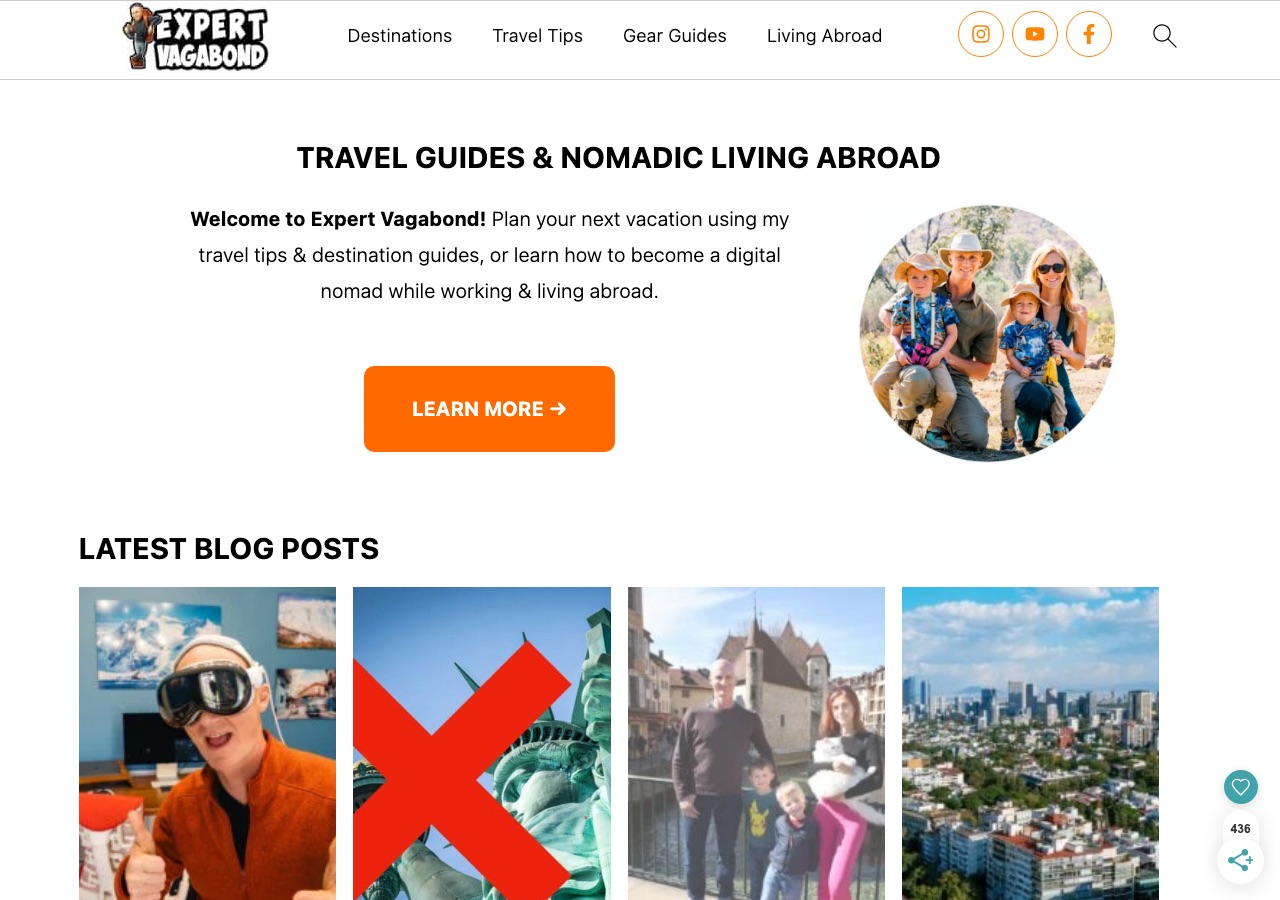
One header row, and it holds everything: an illustrated backpacker wordmark on the left, then Destinations, Travel Tips, Gear Guides and Living Abroad, then three circled social icons and a search glyph. Nothing else. The first content block is a centered heading, Travel Guides and Nomadic Living Abroad, followed by a short welcome paragraph, a single orange Learn More button, and a circular family portrait. Below it, Latest Blog Posts opens a rhythm of four-card rows that repeats through Iceland Travel Guide, Mexico Travel Guide, Useful Travel Tips, Living Abroad, Popular and Seasonal. It is the only homepage in this group with a proper h1 and a clean sequence of h2 section headings, which is to say the visual structure and the document structure describe the same page.
Design Scorecard
A structured assessment across six dimensions. These scores reflect observed patterns, not absolute judgments.
Layout & Structure
A single header row holds the entire chrome: the illustrated backpacker wordmark on the left, then four menu items reading Destinations, Travel Tips, Gear Guides and Living Abroad, then three orange-outlined circular social icons and a search glyph at the right edge, closed by a hairline rule. Below it the page runs as one centered column. A large bold heading, Travel Guides and Nomadic Living Abroad, sits above a two-part introduction: a centered paragraph opening with a bold Welcome to Expert Vagabond, a solid orange Learn More button beneath it, and a circular family portrait to its right. The first content region, Latest Blog Posts, is set left-aligned in the same bold caps used by every section heading that follows, above a row of four equal-width image cards. That pattern, a left-aligned title over four cards, then repeats without variation through the rest of the page. A small floating share widget with a heart icon and a counter sits fixed at the lower right. Visual weight is carried almost entirely by typography and the single orange accent, with no background imagery anywhere above the first card row.
What Works Well
- Four navigation items, each answering a different reader intent: where to go, how to travel, what to carry, how to stay. A reader can hold the whole menu in their head.
- The document outline matches the visual one. A single h1 names the site and its subject, and every section below it is a real h2, which keeps search engines and screen readers reading the same page a sighted visitor sees.
- The affiliate disclosure is written in plain language and states the reader's position first, that it costs them nothing extra, rather than leading with the site's own interest.
- One accent color does all the calling. Orange marks the primary button and the social ring icons and nothing else, so there is never a question about what is clickable.
- The author appears as a person, not a logo. A family photograph beside the welcome paragraph and a first-person bio establish who is speaking before the reader reaches a single recommendation.
What Limits Growth
These are not failures. They are structural constraints that, over time, may limit the blog's ability to evolve.
- Eight consecutive sections share one layout, a title over four cards, so every topic arrives at the same visual weight. A reader scrolling quickly has no cue about which section matters most.
- The Looking For Something search block sits between two destination sections, interrupting the rhythm at the point where a reader is most likely to have found their footing.
- Card thumbnails mix two visual languages. Editorial travel photography sits beside video-style thumbnails with exaggerated expressions and a large red cross, and the inconsistency reads as two different publications sharing a grid.
- Newsletter capture exists only as a Subscribe link in the navigation. There is no on-page form and no stated reason to sign up, which asks a reader to commit before knowing what they receive.
- The nav copy carries a visible spelling error in the Travel Tips dropdown, on an item about travel insurance. Small in isolation, but it sits in the permanent furniture of every page.
Strategic Takeaways
What can other travel bloggers learn from this analysis?
- A narrow menu is a claim about what the site is for. Four items force that claim to be made explicitly.
- Perfect consistency in section layout removes clutter and removes emphasis at the same time. Both are design decisions.
- A disclosure written from the reader's side reads as trust. The same fact written from the publisher's side reads as a legal notice.
- Thumbnail treatment is part of the brand. When two styles share a grid, the grid stops looking curated.
Redesign Considerations
If this blog were redesigned, these are the structural changes worth considering. Not prescriptions, starting points.
- Give two or three sections a distinct treatment, a wider lead card or a full-width band, so the homepage expresses priority rather than only inventory.
- Move the search block to the end of the scroll or into the header, and let the destination and topic sections run as one uninterrupted sequence.
- Set a thumbnail standard and re-crop the outliers, so video-sourced posts read as part of the same publication as the written guides.
- Replace the Subscribe nav link with an on-page form that names what a subscriber gets, placed after the first or second content section rather than in the footer.
- Proof the persistent navigation copy as part of the release checklist, since menu text ships on every page and is the least likely thing anyone reads again.
Closing Thoughts
The design story is restraint applied consistently enough to become a system. Four menu items, one accent color, one card layout, one heading treatment. Nothing on the page is decorative and nothing is ambiguous, and the document structure matches the visual structure closely enough that the page reads the same way to a search crawler, a screen reader and a visitor. Among the sites in this batch it is the clearest example of a homepage designed as an index rather than as a magazine cover.
The tension is that a system this even has no way to say that one thing matters more than another. Eight sections arrive at identical weight, so the ordering carries all the emphasis, and a reader who stops halfway never learns what the site considers its best work. The open question is whether variation can be introduced, a wider lead card or a differently proportioned band, without spending the legibility that the uniformity bought. That is a harder problem than adding decoration, because the thing at risk is the site's actual strength.
Design is not decoration. It's the scaffolding that holds everything else up.
Occasional notes
I sometimes send short notes about design, structure, and monetization in travel blogs.
No schedule. No noise.
Want this level of analysis on your own blog? The same six dimensions, written privately about your site.
Request a blog design audit——→