A Dangerous Business
This analysis looks at a homepage built around a centered logo, and at the structural consequence that follows: when navigation is split to sit either side of a mark, the menu becomes a fixed container, and the taxonomy has to be edited to fit it.
A Dangerous Business is a personal travel blog written by Amanda, a former journalist based in Ohio, and its content sits mostly around United States road trips, short city getaways and packing guidance. The site runs on WordPress and earns through affiliate programs, display advertising, and a set of printables sold through Gumroad. Its disclosure is direct: the site participates in several affiliate programs and earns from qualifying Amazon purchases. The homepage is unusual in this group for how much of its structure is decided by a single graphic choice, a circular logo mark placed dead center of the header.
First Impressions
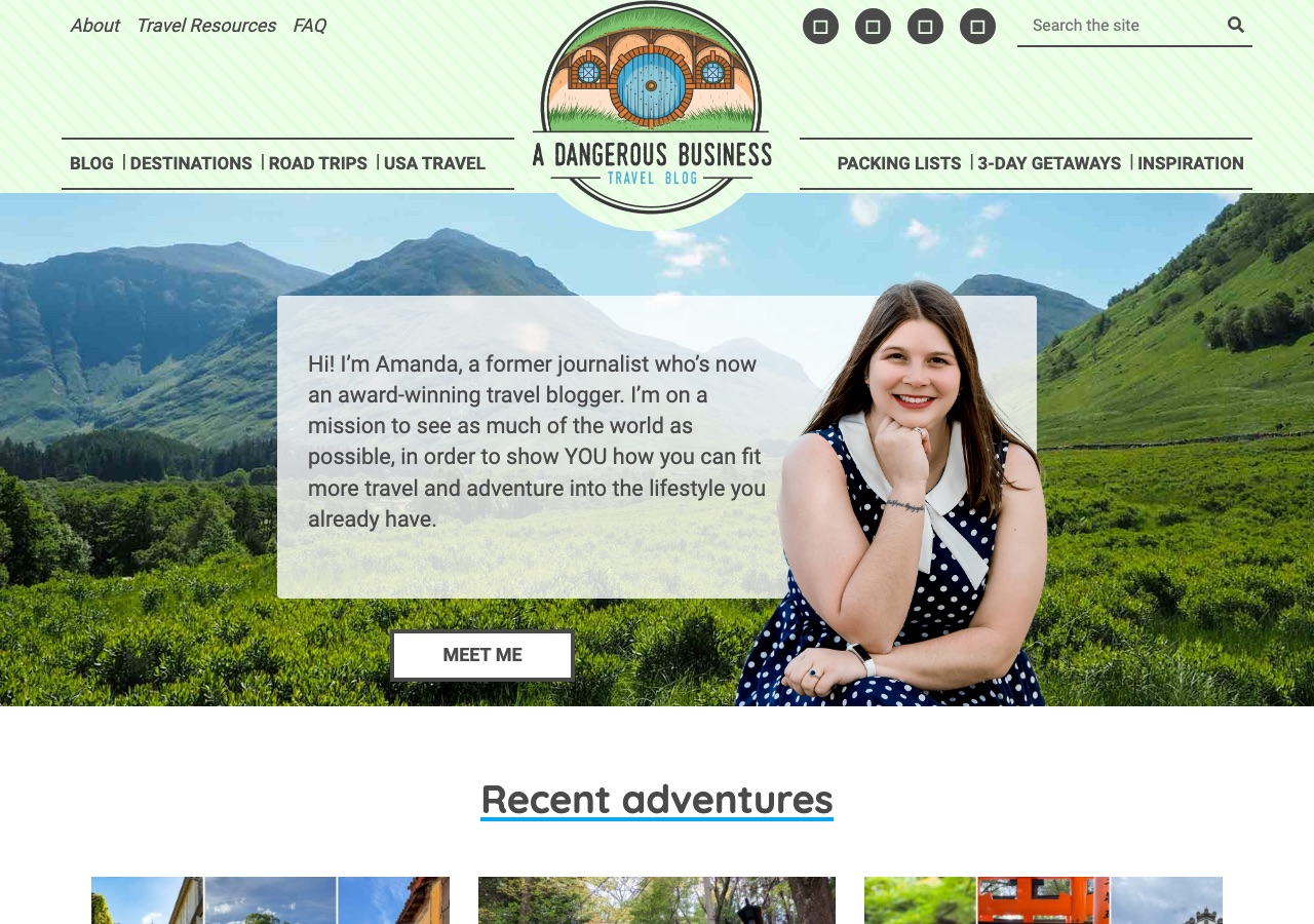
The header is a mint green band with a fine diagonal stripe texture, carrying a small italic utility row of About, Travel Resources and FAQ on the left, and four square social icons plus a Search the site field on the right. In the middle sits a circular illustrated logo, a round green door set into a hillside, captioned A Dangerous Business Travel Blog. The primary menu is then split around it: Blog, Destinations, Road Trips and USA Travel to the left, Packing Lists, 3-Day Getaways and Inspiration to the right, each set on its own rule. Below, a full-bleed photograph of a green valley carries a translucent white card with a first-person introduction and a cut-out portrait, with a Meet Me button underneath. The tone is warm and personal from the first screen, and the header design is the most distinctive of the four sites in this batch.
Design Scorecard
A structured assessment across six dimensions. These scores reflect observed patterns, not absolute judgments.
Layout & Structure
The header is a single mint green band with a fine diagonal stripe, carrying four separate elements arranged around a center point. A small italic utility row sits at the top left with About, Travel Resources and FAQ. Four dark square social icons and a Search the Site field sit at the top right. The circular logo, an illustrated round green door set into a hillside with the site name curved along its lower edge, drops through the middle of the band and overhangs its bottom edge. The primary menu is then split into two rules running left and right of that circle, four items to the left reading Blog, Destinations, Road Trips and USA Travel, three to the right reading Packing Lists, 3-Day Getaways and Inspiration. Below the header, a full-bleed photograph of a green valley fills the hero, with a translucent white card holding a first-person introduction, a cut-out portrait overlapping the card's right edge, and a white-outlined Meet Me button beneath. The first content region opens on white with an underlined Recent Adventures heading above three post images. The logo carries the most visual weight in the header, and the menu items are subordinate to it in both scale and position.
What Works Well
- The hero leads with a person rather than a product. A first-person paragraph and a portrait establish who is writing before any content is offered, which is the right order for a personal blog.
- Homepage sections map directly onto the menu. Recent adventures, Road Trips, 3-Day Getaways, USA Travel and Top Travel Tips each mirror a navigation item, so the scroll teaches the reader what the menu means.
- Every section ends with its own continuation link, More adventures from the blog, More road trip ideas, More getaways, so a reader who finds their topic never has to return to the header.
- The affiliate disclosure is stated plainly and the footer carries a full privacy and disclosure policy, alongside a featured post about how the site earns money. That is an unusually open position on monetization.
- The illustrated logo mark and the mint header give the site a recognizable identity that does not depend on photography, which is rare among personal travel blogs.
What Limits Growth
These are not failures. They are structural constraints that, over time, may limit the blog's ability to evolve.
- The same sections carry two different names depending on which menu a reader uses. One route offers 3-Day Trips, USA Travel Guides and Packing; the other offers 3-Day Getaways, USA Travel and Packing Lists. The destinations are identical, the labels are not.
- A logo-centered split menu is a fixed container. There are three slots on the right and four on the left, and adding a category means removing one or unbalancing the header, so the taxonomy is constrained by a graphic decision.
- The homepage has no h1, and the As Seen On credibility strip is set as an h3 nested below the first content section, so the strongest external trust signal sits low in the document outline.
- The award referenced in the biography is not named, and the As Seen On strip is a single image rather than individually labeled marks, which makes both signals harder to verify at a glance.
- Newsletter capture appears only in the footer. A reader who scrolls a section or two and leaves is never asked, despite the hero being the moment when the personal connection is strongest.
Strategic Takeaways
What can other travel bloggers learn from this analysis?
- A centered logo is a layout decision that quietly becomes an information architecture decision. The header stops being a list and starts being a composition with a fixed seat count.
- Two labels for one destination is not a copy inconsistency, it is two competing mental models of the site presented at the same time.
- Naming a specific award or publication is worth more than the adjective. Unnamed credentials read as modesty and land as vagueness.
- Section-level continuation links let a homepage serve as a hub without asking the header to do the routing.
Redesign Considerations
If this blog were redesigned, these are the structural changes worth considering. Not prescriptions, starting points.
- Pick one label per destination and use it in every menu, footer link and section heading, so the taxonomy reads as one system rather than two.
- Move the logo to the left of a single continuous menu, which frees the header from its seat limit and lets categories be added without redesigning the composition.
- Add a homepage h1 that names the site and its subject, and raise the As Seen On strip so the external credibility appears before the first content section rather than inside it.
- Name the award and label the publications individually, so both trust signals can be checked rather than taken on faith.
- Introduce an email capture after the first or second content section, while the first-person voice from the hero is still doing its work, and keep the footer form as the fallback.
Closing Thoughts
The design story is a site that made its identity decision first and let the information architecture follow. The circular mark and the mint band are memorable, and the hero puts a person and a voice in front of the reader before it puts a single piece of content there, which is the right order for a blog built on personal experience. The sections beneath it mirror the menu one for one, so the scroll teaches the navigation rather than competing with it.
The tension is that the centered logo turned the menu into a composition with a fixed number of seats, and the taxonomy has already been edited to fit. The same sections now carry two sets of labels depending on which route a reader takes, which is the kind of drift that appears when a structure has run out of room rather than when anyone made a choice. The open question is whether the header can be reorganized, most simply by moving the mark to one side of a continuous menu, without losing the symmetry that makes it recognizable in the first place.
Design is not decoration. It's the scaffolding that holds everything else up.
Occasional notes
I sometimes send short notes about design, structure, and monetization in travel blogs.
No schedule. No noise.
Want this level of analysis on your own blog? The same six dimensions, written privately about your site.
Request a blog design audit——→