Along Dusty Roads
This analysis looks at how Along Dusty Roads makes photography the primary structural element of its homepage, and what that decision does to navigation, email capture, and the shape of the business behind the site.
Along Dusty Roads is written by Andrew and Emily, and the footer carries a copyright line running from 2014 to 2026. It is a useful case study because it makes a trade most travel blogs avoid: the homepage is given over to imagery and hand-built collections rather than to search, categories, or product surfaces. The Work With Us page makes the commercial logic behind that trade unusually explicit, which lets the design decisions be read against a stated business model rather than a guessed one.
First Impressions
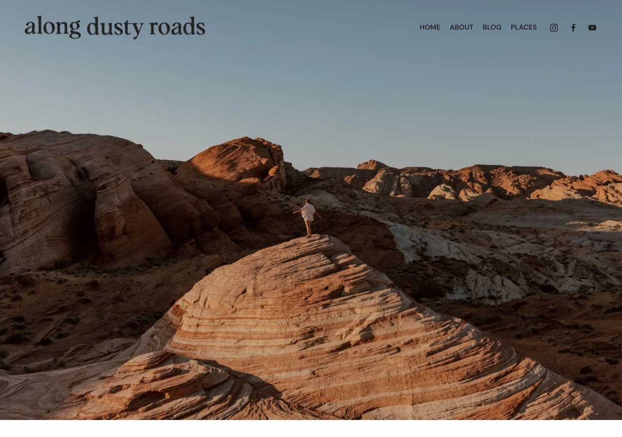
The first screen is almost entirely photograph. A lowercase serif wordmark sits on the left of a slim white header, four navigation labels and three social icons sit on the right, and below them a single image runs the full width of the viewport and most of its height: red rock at low sun, one small figure on a sandstone ridge. There is no headline over the picture, no search field, no email box, and no product. The effect is confident and quiet, closer to a photographer's site than to a publisher's. It also means the sentence explaining what the site is for, which does exist further down, arrives after the reader has already decided whether to scroll.
Design Scorecard
A structured assessment across six dimensions. These scores reflect observed patterns, not absolute judgments.
Layout & Structure
The homepage is a single column of full-width blocks with no sidebar at any point. A slim white header band holds the wordmark on the left and, on the right, four navigation labels followed by Instagram, Facebook and YouTube icons; nothing else shares that row. Directly beneath it a photograph runs edge to edge and fills the rest of the first screen, carrying no overlay headline, no caption, no search field and no button, so the image holds the entire visual weight of the opening. Everything that explains the site sits below that photograph: the introduction from Andrew and Emily, then a run of named editorial blocks including Routes, Stories, Places, Where's Hot Now and Just published, then the individual collections, and last the newsletter form. The rhythm below the fold alternates image-led blocks with short text introductions, so the page reads as a sequence of framed sets rather than as a feed.
What Works Well
- The header stays out of the photograph's way. A wordmark, four labels and three icons are the only text in the first screen, so the image is allowed to do the work it was chosen for.
- Four top-level items hold the whole site, with regional depth folded into a single Places dropdown covering Europe, Central America and Mexico, South America, North America and the Caribbean, Asia and Africa. The menu does not grow as the archive does.
- The Work With Us page states what the site declines: product reviews, sponsored posts, guest posts, group media trips, link exchanges, and complimentary coverage for hosted stays. Publishing the refusals is a firmer credibility signal than a disclosure line on its own.
- The affiliate disclosure is written in plain reader-facing language, and the Ko-fi support link gives readers a way to pay directly rather than only through a purchase.
- The blog index is a single column with no sidebar, so the reading surface honors the promise the homepage makes.
What Limits Growth
These are not failures. They are structural constraints that, over time, may limit the blog's ability to evolve.
- The homepage introduces several parallel concepts, among them Routes, Stories, Where's Hot Now, The Edit, The Island Project and Find Your Somewhere, but only Places appears in the navigation. A reader who values one of the others has no route back to it on a later visit.
- Nothing in the first screen orients a first-time visitor. The sentence that explains the site, addressed to people who love travel and signed by Andrew and Emily, sits below a full-height photograph.
- Email capture appears once, at the foot of the homepage, after every editorial section has already competed for the reader's attention. The strongest moment of interest is usually earlier than that.
- Revenue rests on partnerships, licensing and speaking, all of which are negotiated one at a time. That scales with the founders' hours rather than with traffic.
- The curated collections are assembled by hand, which couples publishing volume to homepage maintenance. Every new section added is a section someone has to keep current.
Strategic Takeaways
What can other travel bloggers learn from this analysis?
- Photography can carry a homepage, but it still needs one sentence of orientation inside the first screen.
- A navigation menu that does not grow with the archive is a real asset. The cost is that editorial collections living outside it become unreachable once they scroll away.
- Stating what you decline is a more durable credibility signal than listing what you accept.
- Restraint in monetization protects the reading experience and caps the revenue ceiling at the same time. Both effects are real, and the choice is worth making on purpose.
Redesign Considerations
If this blog were redesigned, these are the structural changes worth considering. Not prescriptions, starting points.
- Add one or two orienting lines inside the first screen without covering the photograph, for example in a narrow band immediately beneath it.
- Give the recurring collections a permanent home, either in the navigation or in a single collections index, so they accumulate value across visits instead of scrolling out of reach.
- Move a compact email form to a mid-page position, directly after the first editorial section, and keep the footer form as a second opportunity rather than the only one.
- Consider one reader-facing product assembled from work already published, such as a route or itinerary download, so income is not entirely dependent on negotiated partnerships.
- Surface the Work With Us refusals somewhere a reader will see them, not only a brand. They are currently the strongest trust asset on the site and they sit on a page written for advertisers.
Closing Thoughts
The design story here is one of subtraction. Photography is treated as the product rather than as decoration around the writing, and almost every other structural decision follows from protecting it: four navigation items instead of a taxonomy, no sidebar, no advertising, no shop, and a first screen that says nothing in words. Sites that attempt this usually lose their footing on the business side and quietly add the surfaces back. Along Dusty Roads has not, and the Work With Us page shows why it has not needed to, listing partnerships, licensing and speaking alongside an explicit list of the work it turns down.
The tension ahead is between curation and accumulation. The homepage's best material sits in hand-built collections that have no permanent address in the navigation, so each new one competes with the last for the same stretch of scroll rather than adding to a growing shelf. At the same time, income depends on arrangements negotiated one at a time, which grows with the founders' available hours rather than with the audience the photography keeps earning. Both pressures point at the same question: how much structure can be added before the restraint that makes the site distinctive starts to erode.
Design is not decoration. It's the scaffolding that holds everything else up.
Occasional notes
I sometimes send short notes about design, structure, and monetization in travel blogs.
No schedule. No noise.
Want this level of analysis on your own blog? The same six dimensions, written privately about your site.
Request a blog design audit——→