Adventurous Kate
This analysis looks at how Adventurous Kate converts a narrow, well-chosen niche into structure, and where the site's archive depth and missing email capture put a ceiling on what that structure can return.
Adventurous Kate is written by Kate McCulley and positions itself around solo female travel, a promise stated in the logo lockup itself, which reads travel for independent women. The site is a useful case study in positioning done well at the navigation layer: the niche is not a category buried in a menu, it is a top-level destination in its own right. It is also a useful case study in maintenance, because a site this old accumulates copy in several places that then has to agree with itself.
First Impressions
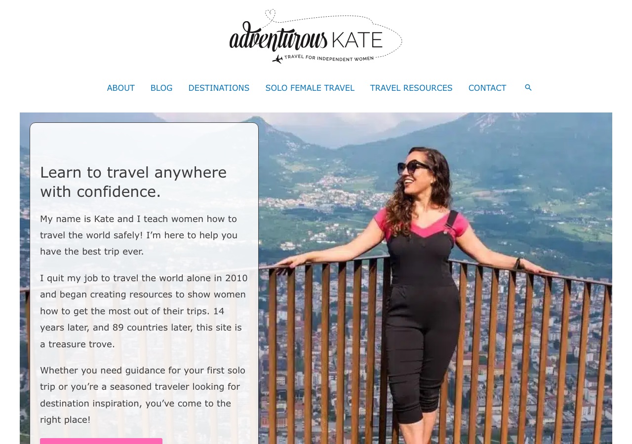
The first screen is orderly and centered: a script and sans logo lockup with a dotted flight path drawn through it, a tagline naming the audience, then six navigation labels and a search icon on one clean row. Below that, a full-width photograph with a white card floating over its left third. The card carries the headline, learn to travel anywhere with confidence, and then three paragraphs of introduction before a button. The headline is excellent and the card is well placed, but the copy beneath it asks a first-time visitor to read a short essay before doing anything. The button that would let them act is pushed to the edge of the fold by the paragraphs above it.
Design Scorecard
A structured assessment across six dimensions. These scores reflect observed patterns, not absolute judgments.
Layout & Structure
The header is centered and built in two quiet rows. The first holds the logo lockup on white, a script and sans wordmark with a dotted flight path drawn around it and the audience named in small capitals underneath. The second holds six navigation labels on a single line, evenly spaced and ending with a search icon, with no dropdown arrows shown at rest. Below them the hero runs the full width of the page: a photograph of Kate at a viewpoint above a valley town, with a white card floating over its left third. The card is the only text in the first screen and it is dense, carrying the headline followed by three paragraphs of introduction and then a button that sits at the lower edge of the fold. Further down the homepage continues as stacked full-width sections without a sidebar, moving through solo female travel guides, latest posts, top destinations, popular posts and an As Seen In row. The sidebar appears elsewhere in the site rather than here: on the blog index and on article pages a right column carries a Meet Kate bio, social links, a promotional banner and two content lists.
What Works Well
- The niche is promoted to the navigation bar. Solo Female Travel sits beside Destinations rather than inside it, so the site's differentiator is structural and not just editorial.
- The tagline lives inside the logo lockup, which means the audience is named on every page without spending a line of layout on it.
- The affiliate disclosure on article pages is short, specific and written in the first person, stating that a purchase through a link earns a commission at no extra cost. Placing it at the top of the article rather than in a footer is the stronger choice.
- Long guides carry a working table of contents, which is the right response to the length these posts run to.
- The hero headline states a benefit rather than a topic. Learning to travel anywhere with confidence is a promise a reader can measure, which is rarer in travel than it should be.
What Limits Growth
These are not failures. They are structural constraints that, over time, may limit the blog's ability to evolve.
- No email capture appears on the homepage, the blog index, or the article page examined. For a site whose value is trusted advice to a specific audience, that is the largest missing surface, and the sidebar space it would need is currently spent on a promotional banner.
- The hero card carries three paragraphs before its button. The first paragraph does the work; the second and third push the only action in the first screen down and out of comfortable reach.
- The blog index paginates to 119 pages and does not show publication dates on listings, so neither depth nor freshness is navigable. A reader cannot tell whether a guide is current before opening it.
- The self-description drifts between surfaces. The homepage hero says fourteen years and 89 countries, while the sidebar bio on article pages says 99 countries and seven continents. Small inconsistencies like this are cheap to fix and quietly expensive to leave.
- The sidebar mixes a bio, social links, a commercial banner and two content lists in one column, so the promotional unit competes with the navigational ones instead of being the only thing asking for a click.
Strategic Takeaways
What can other travel bloggers learn from this analysis?
- Putting the niche in the navigation bar, not inside a dropdown, is what turns positioning into structure.
- A hero can hold a headline, one paragraph and a button. The third paragraph is usually the one that costs you the click.
- Dates on an archive listing are a trust feature, not a metadata detail. Without them a deep archive reads as unmaintained even when it is not.
- Every place the site describes itself is a place that has to be kept in agreement. A single source for the numbers prevents the drift entirely.
- An audience this well defined is worth an email list. Advice-led sites monetize relationships, and the relationship needs a place to start.
Redesign Considerations
If this blog were redesigned, these are the structural changes worth considering. Not prescriptions, starting points.
- Add email capture in at least two places: an inline form after the first section of long guides, and a compact form at the top of the sidebar above the promotional banner.
- Cut the hero card to a headline, one paragraph and the button, and move the longer introduction to the about page it already links to.
- Show publication or last updated dates on blog index listings, and replace deep pagination with filters by destination and by theme so the archive is enterable from more than the first page.
- Store the countries visited figure and the years travelling figure in one place and reference it wherever the site describes itself, so hero and sidebar cannot disagree.
- Give the sidebar a single commercial slot and let the rest be navigation, so the promotional unit is not competing with the site's own content for the same attention.
Closing Thoughts
The design story is one of positioning expressed structurally rather than stated in copy. The audience is named inside the logo, the niche is given a place in the navigation bar instead of being filed inside a destinations menu, and the hero leads with a benefit a reader can measure rather than with a topic. Those three decisions do more to explain who the site is for than any amount of about-page prose would, and they hold on every page because they live in the header rather than in the content.
The open question is what happens to fourteen years of work now that it has accumulated. The archive runs to more than a hundred pages of pagination without dates on the listings, so its depth is difficult to enter and its currency is difficult to judge, and there is no email capture on the surfaces reviewed, so a reader who trusts the advice has no way to stay in contact with it. Both point at the same shift: the next layer of growth for a site this well positioned is likely to come less from new posts than from making the existing ones findable and from giving the relationship somewhere to begin.
Design is not decoration. It's the scaffolding that holds everything else up.
Occasional notes
I sometimes send short notes about design, structure, and monetization in travel blogs.
No schedule. No noise.
Want this level of analysis on your own blog? The same six dimensions, written privately about your site.
Request a blog design audit——→